
🎨🧱 Frontend Component Library
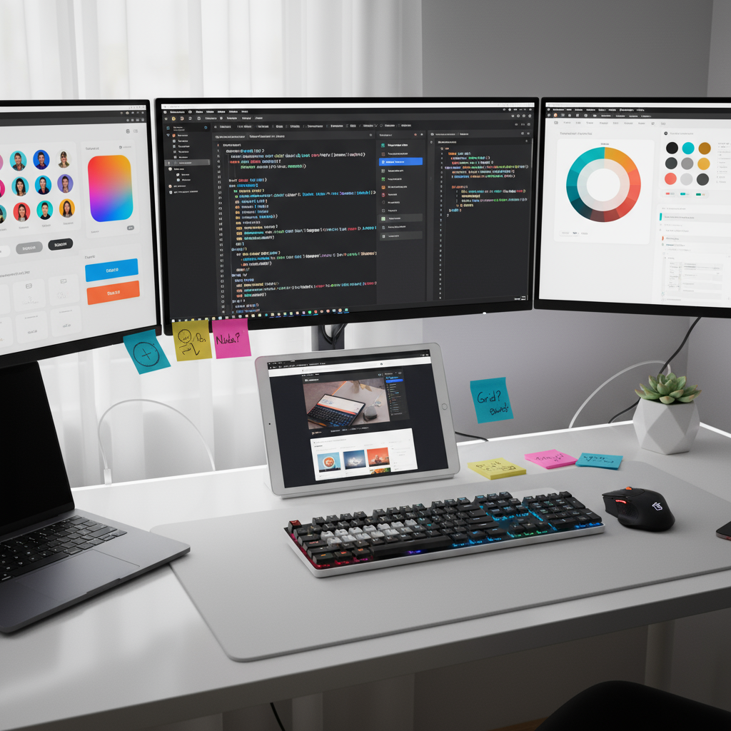
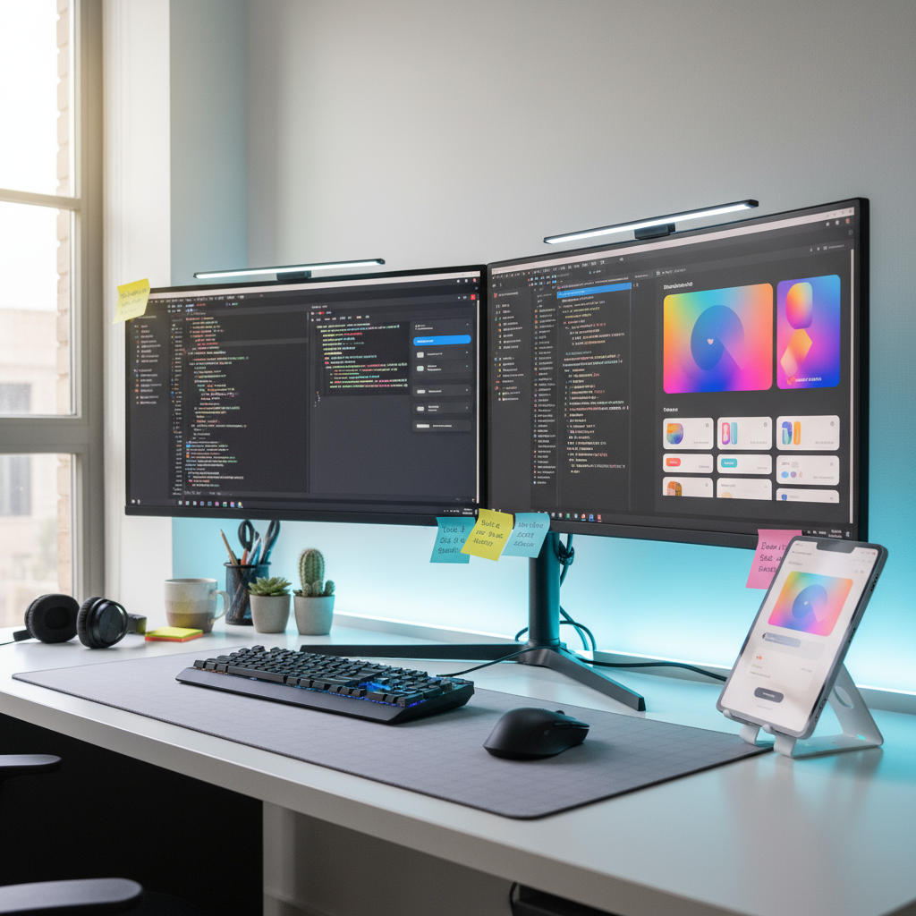
A sleek, customizable collection of reusable UI components built to speed up web development and ensure design consistency across projects. The Frontend Component Library provides developers and designers with a ready-to-use toolkit of modern, responsive elements—from buttons and forms to full-page layouts—perfect for building beautiful, functional interfaces in record time.
Ideal for startups, agencies, and frontend developers looking to streamline workflow and maintain a professional, cohesive look across all products.
📦 What’s Included
• 50+ pre-built, responsive UI components (buttons, modals, navbars, cards, etc.)
• Design system foundation with colors, typography, and spacing tokens
• Dark/light mode variants and accessibility-ready styles
• Documentation and example pages for quick implementation
• Integration guides for React, Vue, and plain HTML/CSS
• Bonus: Figma design kit for rapid prototyping
🌟 Key Benefits
• Save time—no need to design or code components from scratch
• Maintain a consistent, professional design language
• Fully customizable to match your brand identity
• Scalable architecture for small apps or large web platforms
• Compatible with modern frameworks and build tools
👥 Perfect For
• Frontend developers and web designers
• Product teams and digital agencies
• SaaS startups building UI at scale
• Developers creating design systems or style guides
📁 Format & Delivery
• Instant digital download (React + Vue + HTML versions)
• Includes full documentation and usage examples
• Editable source files + Figma design kit for customization

Reviews
There are no reviews yet.